RENOLOGIST
The Role of Colours in Interior Design
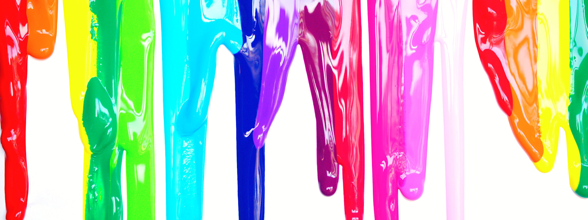
Learn how to leverage on colours to build your perfect space!
Colour plays a crucial role in interior design, influencing mood, perception, and the overall ambiance of a space. In Singapore, where urban living meets tropical nature, choosing the right colours can transform a home into a comfortable and visually appealing retreat. By understanding how different colours affect emotions and complement various design elements, homeowners can make informed choices that enhance their living spaces.

Understanding Colour Psychology
Colours evoke emotions and can significantly impact how we feel in a space. Some shades bring energy and warmth, while others promote relaxation and tranquility. The strategic use of colours in interior design can create specific atmospheres suited to different rooms and lifestyles.
Warm Colours for Energy and Vibrancy
Warm colours, such as red, orange, and yellow, are known for their stimulating and energizing effects. These shades are excellent for social areas like living rooms, dining spaces, and kitchens, where interaction and activity take place.
Red: This bold and powerful colour stimulates energy and excitement. In Singaporean homes, red can be used sparingly as an accent wall, in decorative elements, or in furniture to avoid overwhelming a space.
Orange: Representing enthusiasm and creativity, orange works well in communal areas, promoting a sense of warmth and togetherness.
Yellow: Associated with brightness and positivity, yellow is perfect for kitchens and study areas, adding a cheerful and inviting touch.
Cool Colours for Calm and Relaxation
Cool colours, such as blue, green, and purple, bring a sense of tranquility and peace. These shades are ideal for bedrooms, bathrooms, and relaxation zones.
Blue: Known for its calming effect, blue is excellent for bedrooms and bathrooms, providing a restful environment. Lighter shades can make small Singaporean apartments feel more spacious.
Green: Reflecting nature, green adds a refreshing and rejuvenating element to any home. It pairs well with indoor plants, creating a harmonious balance between modern interiors and the lush tropical surroundings of Singapore.
Purple: Symbolizing luxury and sophistication, purple is suitable for creating a serene and elegant ambiance. Lighter shades like lilac are ideal for bedrooms, while deeper purples add richness to living spaces.
Neutral Colours for Versatility and Balance
Neutral colours like white, grey, beige, and brown serve as the foundation of interior design. They create balance and allow for greater flexibility when incorporating accent colours.
White: A popular choice in Singaporean homes due to its clean and spacious feel, white enhances natural light and makes rooms appear larger.
Grey: A modern and sophisticated choice, grey provides a stylish backdrop for various design styles, from minimalist to industrial.
Beige and Brown: These earthy tones bring warmth and comfort, making a home feel cozy and inviting.
Choosing Colours for Living Spaces
In Singapore, where homes range from compact HDB flats to spacious landed properties, selecting the right colour palette can maximize space and create the desired atmosphere. Here are some considerations when choosing colours for different areas:
Living Room

As a central gathering space, the living room should feel welcoming and comfortable. Neutral colours like beige or light grey serve as excellent base colours, allowing accent shades like mustard yellow, teal, or deep green to add personality without overpowering the space.
Bedroom

For restful sleep and relaxation, soft and cool colours work best. Light blue, pastel green, and lavender create a peaceful retreat, while warm beige tones add coziness without feeling heavy.
Kitchen

A vibrant and inviting kitchen encourages social interaction and creativity. White or cream cabinets paired with accents of yellow or terracotta can brighten the space, making it feel both modern and homely.
Bathroom

For a spa-like feel, shades of light blue, seafoam green, or soft grey promote relaxation. White tiles with subtle colour accents can keep the space fresh and airy.
Tips for Using Colour Wisely
Consider Natural Light: The amount of natural light a room receives can affect how colours appear. Brighter spaces can handle deeper tones, while dimmer rooms benefit from lighter shades.
Use Accents to Add Depth: Instead of overwhelming a space with bold colours, use them in accessories, artwork, or feature walls.
Maintain Harmony: Ensure that colours flow seamlessly from one room to another for a cohesive home design.
Experiment with Textures: Different materials and finishes can enhance the effect of colours. Matte, glossy, and textured surfaces interact with light differently, adding depth to the overall design.
Final Thoughts
Colours have a huge impact on how a space feels and functions. In Singapore, where homes often need to be both stylish and practical, a well-thought-out colour palette can enhance comfort, productivity, and even property value. Whether you prefer warm, cool, or neutral tones, the right colour combinations can transform any room into a beautiful and functional home.
At Renologist, we believe that effective interior design is all about creating spaces that reflect the unique lifestyle and cultural influences of Singapore. Our portfolio showcases a range of projects where thoughtful colour choices have turned raw spaces into vibrant, inviting homes. Moreover, our blog is filled with expert tips and insights - from understanding the psychological effects of colours to practical design advice - that can help you make informed decisions about your own space. Our blog section offers expert tips and insights on interior design to help you make informed decisions about your space.
To explore more about how the right colours can transform your space, visit our homepage and discover a world of design possibilities tailored to Singapore’s vibrant and ever-evolving landscape.
Posted on Oct 20, 2023, updated 10 months ago.